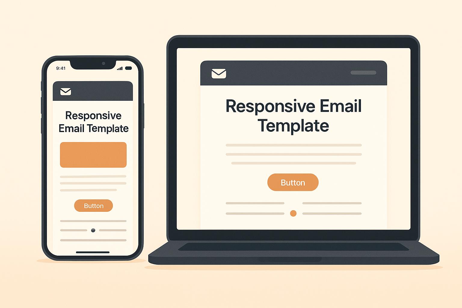
Over 70% of emails are opened on mobile devices in 2025. If your emails aren’t mobile-friendly, 8 out of 10 recipients might delete them instantly. Responsive email templates ensure your messages look great and work seamlessly on any device, improving engagement and maintaining brand trust.
Key Takeaways:
- Mobile-first design: Start with simple, single-column layouts and readable fonts (16px+ for body text).
- Optimize visuals: Use compressed images with
max-width: 100%and buttons at least 44×44 pixels for easy tapping. - Accessibility: Focus on color contrast, alt text for images, and clear navigation.
- Dark mode: Test for compatibility and use muted tones that work in both light and dark themes.
- Testing: Use tools like Litmus or Email on Acid to preview your designs across devices and email clients.
Responsive design isn’t just about aesthetics – it boosts clicks, enhances usability, and saves time. Whether you’re a small business or a major brand, making emails accessible and mobile-friendly is essential in 2025.
Email Design Best Practices | Responsive Email Design
Mobile-First Design Principles for Responsive Emails
With over 80% of emails being opened on mobile devices and mobile users checking their inboxes three times more often than desktop users, mobile-first design has become a central focus for email marketing in 2025. The idea is simple: start designing for the smallest screens first, then scale up for larger devices. This approach shapes everything from layout to typography.
Simple Layouts and Readable Fonts
When it comes to mobile-friendly design, single-column layouts are your best friend. Unlike multi-column designs, which can feel cramped on smaller screens, single-column layouts stack content vertically, making emails clean, easy to scan, and effective across all devices.
Keep your email width within 600px for proper display. Choose a base font size between 16–18px for body text and 22–26px for headers. Avoid fonts smaller than 14px, and use line spacing of 1.4–1.6 for better readability.
Stick to web-safe fonts like Arial, Helvetica, or Georgia, and always include fallback options in your code to ensure consistency across email clients. Short paragraphs, clear headings, and bullet points can also make your content easier to skim, which is key since mobile users tend to scan emails quickly. Place your most important message or call-to-action (CTA) at the top of your email to grab attention immediately.
How to Optimize Images and CTAs for Mobile
Images and CTAs play a huge role in mobile email design, but they need to be optimized carefully. Use CSS properties like 'max-width: 100%' and 'height: auto' to ensure images adjust to screen size. Compress files to keep load times fast, and always include descriptive alt text to provide context if images fail to load.
For CTAs, design buttons that are at least 44×44 pixels in size, making them easy to tap. Use high-contrast colors and ample spacing around buttons to ensure they stand out. HTML-based buttons or clearly styled text links are ideal for creating a seamless experience.
White space is another critical element for mobile design. It improves readability and separates content effectively, making your email feel less cluttered.
Interestingly, emails with three or fewer images and 20 lines of text tend to have higher click rates. This highlights the importance of simplicity – focusing on essential elements ensures your message is clear and engaging. These mobile-first strategies lay the groundwork for creating responsive, user-friendly email templates.
Creating Fluid Layouts and Structuring Responsive Code
To ensure your emails look great on any device or email client, you’ll need to focus on fluid layouts and clean, responsive code. These techniques help your emails adapt seamlessly, whether they’re being viewed on a smartphone or a desktop.
Fluid layouts rely on percentage-based widths to scale naturally, rather than depending solely on media queries to adjust content. This makes them particularly effective for text-heavy emails, providing a consistent experience across different screen sizes and devices.
Using HTML Tables for Consistent Rendering
HTML tables may feel like a throwback to older web development practices, but they remain the most reliable tool for email design in 2025. Why? Because email clients often have inconsistent CSS support, and tables provide dependable rendering across platforms.
Here’s how to use tables effectively for fluid layouts:
- Stick to percentage-based widths: Use attributes like
width="100%"rather than fixed pixel values. This ensures your tables can expand and contract based on the available screen space. - Limit table nesting: Avoid deeply nested tables, as they can cause rendering issues and make your code harder to manage.
- Set a maximum width: Keep your main container table at a maximum width of 600px for desktop clients, while also using
width="100%"to ensure proper scaling on mobile devices. - Handle images carefully: Apply both
width="100%"andmax-widthproperties to images. This ensures they resize correctly without breaking your design.
Once your table structure is in place, you can refine the design further with inline CSS and media queries.
Applying Inline CSS and Media Queries
Inline CSS is critical for email development because many email clients require styles to be embedded directly into the HTML for consistent rendering. For example, you can apply styles like style="width:100%; max-width:600px;" directly to your container tables.
Media queries, on the other hand, allow you to fine-tune specific elements – like font sizes, padding, or button dimensions – for different screen sizes. These should be included in the <head> section of your email.
Here are a few tips for working with inline CSS and media queries:
- Avoid overusing
!important: While it can override styles, excessive use can clutter your code and make troubleshooting difficult. - Stick to traditional CSS properties: Advanced techniques like flexbox or grid are tempting but often lack support across email clients. Instead, rely on tried-and-true properties for compatibility.
- Test thoroughly: Check your email across various devices and screen sizes to ensure everything renders as intended.
Designing for Accessibility and Dark Mode
When creating email templates, it’s crucial to go beyond aesthetics and focus on inclusivity. With 1 in 4 adults in the US and EU living with disabilities and 1.4 billion people projected to be 60 or older by 2030, accessibility in email design is no longer optional. Add to that the fact that 35% of email opens in 2022 were in dark mode, and it’s clear that designing for everyone is a key part of your email strategy for 2025.
Making Your Email Design Accessible
Accessible email design ensures that your message can be read and understood by everyone, including people who rely on assistive technologies. At its core, this means focusing on color contrast, readability, and structure.
Start by using tools like WebAIM‘s Color Contrast Checker to verify that your text has enough contrast against its background. High-contrast colors are essential for users with visual impairments or color blindness. Also, avoid using color alone to communicate important information – pair it with text or icons for clarity.
Font selection plays a big role in accessibility. Thin fonts can be hard to read, so consider using bold fonts, especially for dark mode. Increasing font size and line height will also make your content easier to read across different devices and lighting conditions.
To improve navigation for screen reader users, structure your emails with semantic HTML and a clear content hierarchy.
Finally, test your emails with accessibility tools like Microsoft’s Accessibility Insights or Axe DevTools browser extensions.
Now, let’s talk about making your designs work seamlessly in both light and dark environments.
How to Optimize Emails for Dark Mode
Optimizing for dark mode is just as important as ensuring accessibility. However, dark mode can be tricky since email clients handle it differently – some invert colors completely, while others make partial adjustments.
To start, include the following meta tags in your email’s <head> section to signal support for both light and dark modes:
<meta name="color-scheme" content="light dark"> <meta name="supported-color-schemes" content="light dark"> Next, use media queries like @media (prefers-color-scheme: dark) to create custom styles for dark mode. For Outlook apps, you may need to duplicate these styles using [data-ogsc] or [data-ogsb] prefixes to ensure compatibility.
Images require special attention in dark mode. For transparent PNGs, add translucent outlines to ensure logos and graphics remain visible against dark backgrounds. For social media icons or stroke-based designs, consider adding outlines or shape backgrounds to maintain visibility.
"One simple thing that works well is to keep your text content as black text on a white background. It does mean some limitations on your design, but there is still plenty of opportunity to get creative around the outside of the text and make things look great." – Mark Robbins
When it comes to color selection, opt for muted tones that work well in both light and dark modes. Colors in the mid-range of brightness tend to maintain good contrast on both white and black backgrounds. Avoid pure white on pure black combinations, as they can strain the eyes and may even be inverted by some email clients.
Finally, testing is non-negotiable. Each email client handles dark mode differently, so test your designs across multiple platforms to ensure consistency. Simplify your color palette to reduce unexpected variations when switching between modes.
sbb-itb-2d4bf0e
Testing Responsive Email Templates
Creating a responsive email template is just the beginning; the real challenge lies in ensuring it looks and functions properly across all email clients. Different email platforms interpret HTML and CSS in unique ways, which means an email that looks flawless in Gmail might appear distorted in Outlook. Once you’ve tackled the design hurdles, thorough testing is essential to guarantee your emails perform well everywhere.
Email Testing Tools You Should Use
Testing tools are indispensable for confirming that your mobile-friendly and fluid designs hold up in a variety of email clients. Industry leaders like Litmus and Email on Acid allow you to preview your emails across 90+ email clients, saving you from unpleasant surprises.
- Litmus: Known for its detailed previews, this tool boasts a 4.7-star rating on Capterra and starts at $99/month for its Basic plan.
- Email on Acid: Offers similar features, including Campaign Precheck, with a 4.5-star rating on G2. Plans also begin at $99/month.
- Email Preview Services: A more budget-friendly option, starting at $25/month for unlimited previews and basic testing.
- Mailtrap Email Testing: Perfect for light use, it offers a free plan for up to 100 emails per month, with paid plans starting at $14.99/month.
If you’re already using platforms like HubSpot or Campaign Monitor, take advantage of their built-in testing tools. HubSpot integrates Litmus-powered previews for about 30 email clients, while Campaign Monitor includes inbox preview testing in its Unlimited and Premier plans.
Pre-Send QA Checklist
Even after using testing tools, a manual quality assurance (QA) check is critical to ensure that every detail is in place. For instance, one major brand saw better deliverability and fewer bounce rates by implementing rigorous pre-send checks.
Start with your subject line and preheader text. Make sure they’re engaging, concise, and don’t include spam-triggering words, as these can affect performance across email clients.
Next, review the content of your email. Proofread for typos and double-check that personalization tokens are correctly set up to avoid broken merge tags.
Test all links, buttons, and images to ensure they work as intended and lead to the correct destinations. Add alt text for images to improve accessibility and keep the total email size under 102KB to avoid Gmail clipping issues.
Don’t forget to test for light and dark mode rendering. Confirm that color contrast meets accessibility guidelines (minimum 4.5:1 ratio) and that fonts are legible at 16pt or larger.
Make sure your unsubscribe link is easy to find and functional to comply with CAN-SPAM and GDPR regulations. Run spam tests to identify any issues with your content and ensure that linked domains are not blocklisted.
"This allows you to review your preheader text, address accessibility issues, validate URLs and images, run spell check, see if you’ve been blocklisted, run spam tests, and then preview how your email renders on more than 90 of the most popular devices and email clients." – Email on Acid
Finally, send test emails to yourself and your team. Reviewing the email in actual inboxes often uncovers issues that automated tools might miss. This step provides peace of mind that your responsive design will deliver the intended experience to your subscribers.
Using Groupmail‘s Responsive Email Builder
Now that we’ve covered the essentials of responsive design and testing, it’s time to put those principles into action with a tool that simplifies the process. Groupmail offers an intuitive platform that makes creating responsive emails a breeze – no heavy coding required.
Drag-and-Drop Interface for Easy Customization
Groupmail’s drag-and-drop editor makes designing emails simple and accessible. You can effortlessly add elements like text, images, buttons, dividers, and social media links, all while customizing the layout to fit your needs. Need more content rows? Just drag them in – it’s that easy! Plus, the platform ensures your emails display perfectly across all major email clients, so you don’t have to worry about compatibility issues.
Revanth, an IT professional, highlights Groupmail’s user-friendly approach, stating: "GroupMail has a simple interface with good features for email marketing and is easy to use". The platform consistently earns high ratings on SoftwareAdvice.com, with an overall score of 4.3 out of 5, including 4.3/5 for Ease of Use and 4.4/5 for Value for Money.
This seamless interface sets the stage for Groupmail’s standout mobile optimization features.
Built-In Mobile Optimization and Testing
Groupmail takes the guesswork out of mobile email design with tools that include real-time previews, automatic adjustments for mobile devices, and integrated spam testing. Whether you’re working with HTML or plain text formats, the platform ensures your emails look polished on any screen. Plus, its spam testing feature helps protect your sender reputation.
These capabilities directly tackle the mobile-first and testing concerns we discussed earlier. As Jon Case, CEO of School Software Solutions Ltd, explains:
"We have used GroupMail successfully for several years. The software is superb. Very easy to use and what little technical support we have needed has been excellent. I would highly recommend GroupMail to any business with email at the heart of their marketing strategy".
Groupmail also provides a library of professionally designed, fully responsive templates that are regularly updated to ensure compatibility with all major email clients. To make the most of these tools, use the Preview option to see how your email will look on both mobile and desktop before hitting send. Leverage the responsive design features to ensure your emails adjust automatically to different screen sizes, and always run your messages through the spam testing tool to maintain strong deliverability rates.
Conclusion: Key Takeaways for 2025
Why Responsive Email Design Matters
In 2025, responsive email design is no longer optional – it’s essential. With over 70% of emails being opened on mobile devices and 80% of recipients deleting emails that don’t display properly, failing to prioritize responsive design means risking engagement and performance drops.
Responsive design does more than just make emails look good; it drives higher engagement, boosts conversions, and ensures brand consistency. Plus, with individuals with disabilities controlling over $1 trillion in annual disposable income, making emails accessible isn’t just the right thing to do – it’s a smart business move. These benefits lay the groundwork for refining your email strategy.
Next Steps for Better Email Templates
To take your email templates to the next level, focus on three key areas: mobile-first design, accessibility, and thorough testing. Start with a mobile-first approach, designing for smaller screens first and then adapting for desktops. This ensures your primary audience gets the best experience, no matter how they view your emails.
Incorporate accessibility features like proper color contrast, alt text for images, and easy-to-read fonts. These adjustments not only help users with disabilities but also enhance the overall usability of your emails.
Testing is a must. Before hitting send, preview your emails on various devices and email clients to catch any rendering issues. This simple step can make a huge difference in keeping your communications polished and professional.
If you’re looking for tools to simplify the process, Groupmail’s responsive email builder has you covered. Its drag-and-drop interface, built-in mobile optimization, and testing features make it easy to implement these best practices without diving into complicated coding.
While email trends will continue to evolve, the core principles of responsive design remain constant. By embracing these strategies now, you’ll set your email campaigns up for success in 2025 and beyond.
FAQs
How can I make my email designs accessible for users with disabilities?
To design emails that everyone can easily access and enjoy, focus on inclusivity by keeping these tips in mind:
- Include descriptive alt text for images so screen readers can explain their purpose to visually impaired users.
- Opt for high-contrast color combinations to make text and visuals easier to read.
- Select clear, easy-to-read fonts and avoid using text that’s too small.
- Organize your email with semantic HTML elements, such as headings and lists, to make navigation smoother.
- Use descriptive link text like "Explore our latest tips" rather than vague phrases like "Click here."
It’s also a good idea to run your emails through accessibility tools to ensure they meet standards like ADA and Section 508. By making accessibility a priority, your emails can reach and resonate with a broader audience.
What mistakes should I avoid when designing emails for dark mode?
When creating emails for dark mode, steer clear of using fixed background colors that don’t adjust to dark mode settings. This can lead to text or visuals becoming hard to read. Instead, focus on ensuring strong contrast so your content stays clear and readable in both light and dark modes.
Pay special attention to logos or images with transparent backgrounds – they can disappear against dark backgrounds, making them hard to spot. Additionally, avoid thin or very light fonts, as these can compromise readability, especially on smaller screens. To wrap it all up, make sure to test your emails on various devices and email clients to confirm they perform well in dark mode.
Why should you test your email templates on different devices and email clients?
When it comes to email templates, testing them across different devices and email clients is a step you simply can’t skip. Why? Because not every platform displays emails the same way. Each email client has its own rendering engine, which can cause variations in how your design appears. If you skip testing, you risk sending out emails with layout glitches, broken elements, or text that’s hard to read.
Thorough testing ensures your email looks polished and works seamlessly, no matter where it’s opened. This consistency not only makes your content easier to read but also encourages engagement and reinforces trust with your audience.